The initial temptation when pricing a product is to use cost plus pricing, where you add a mysterious comfort buffer to your costs to work out your rate card. Articles like this one where the author advocates that “I generally start at 10x and drop the x-factor down from there until I arrive at something that feels right” scare the crap out of me. Yes, I agree that costs are extremely important and that complexity is to be avoided at all costs, but seriously put some genuine thought and research into it.
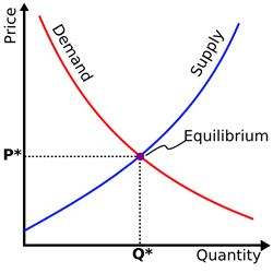
The key point to realise is that pricing is all based on the classic supply and demand curve. This has two huge impacts:
1. Pricing needs to take into account both supply (competitors) and demand (consumers)

Supply & Demand Meet at Your Price
Spend some time doing research on your competitors. Get their rate cards, not just word of mouth evidence. Your sales people will often be given rate cards by prospective customers, there is no vendor loyalty when a customer is negotiating hard and you should benefit from that where you can. If it is a new product and you don’t think you have competitors, think again. You actually need a competitor. Humans decision making is an extremely relative process, so it is important to establish in the consumers mind who your competitors are and why they should change their mind. Take this TIVO example. There were no competitors when TIVO came on the market. The closest two existing products were a $100 VCR and a $1000+ computer. No prizes for guessing which device they compared themselves to.
Sometimes it takes a bit of trickery to associate your new product with the desired pricing benchmark. The most infamous case is cited in the book Predictably Irrational. James Assael was the “Product Manager” for Black Pearls, a product were not only completely unknown, but also proved unwanted. So what to do?
James Assael could have dropped the black pearls altogether or sold them at a low price to a discount store. He could have tried to push them to consumers by bundling them together with a few white pearls. But instead Assael waited a year … and then brought them to an old friend, Harry Winston, the legendary gemstone dealer. Winston agreed to put them in the window of his store on Fifth Avenue, with an outrageously high price tag attached. Assael, meanwhile, commissioned a full-page advertisement that ran in the glossiest of magazines. There, a string of Tahitian black pearls glowed, set among a spray of diamonds, rubies, and emeralds.
“The pearls, which had shortly before been the private business of a cluster of black-lipped oysters, hanging on a rope in the Polynesian sea, were soon parading through Manhattan on the arched necks of the city’s most prosperous divas. Assael had taken something of dubious worth and made it fabulously fine.”
Today this happens all the time. Apple introduced the iPhone at $599, then only 2 months after launch they cut the price by a massive $200 to $399. They set their price benchmark, and then slash the price to rapidly accelerate sales volumes with a heavily “discounted” offering. This brings me to my second point.
2. Pricing is not a straight line, linear pricing models do not work with scale

iPhone Price Cut! (?)
Apple also slashed the iPhone price after only 2 months to drive those critical initial sales volumes as early as possible. As your production scales your costs are exponentially falling, especially when a product is being brought to market for the first time. This also reinforces why cost plus pricing is an impossible task, to be accurate your price would need to be different for each individual unit you sell.
This scaling effect will also cause problems on the demand side. Put simply, cost plus pricing will cause you to over-price your product when there is a weak market and will cause you to under-price your product when there is a strong market. Again this is due to the curved nature of the demand curve, a straight line simply doesn’t fit.
Prices represent single points on a graph, so how do you create points that form a curve? You need an end-to-end product portfolio.
Conclusion: Plan an end-to-end Product Portfolio
The first key is to segment your target markets. You then need to set a goal for what you would like to achieve in that market (low end market share, diversify customer profile, leverage brand etc.) and scope a product to suit both. If you understand your target market you are understanding the demand curve, by figuring out what you have to offer you can determine the supply side of the curve. Add-ons are a great example of being able to target different markets without straying too far from your core focus.
How many add-ons should you have? The paradox of choice suggests that 3 to 6 choices is about the right number, otherwise the customer starts to get overwhelmed with the sheer number of comparison decisions being made.

37Signals Basecamp Account Choices
You can make things even easier for the customer. 37Signals recently blogged how a simple (and not so subtle) change of their account selection screen to promote a particular product from their range greatly helped people make a quick no-fuss decision. Even the order of the pricing can have a big effect, so don’t start thinking that once you have a price that you are finished!
In the end your rate card need to be treated just like your product itself, you need to keep testing it against the market and making sure you are still fitting the curve. Simple delivery and accounting practices help here, so don’t overcomplicate things. 
 I was looking for good Product Management reading material, and was referred by a friend to the book “Getting Real” by 37Signals.


