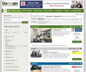
Domain.com.au have updated their search tool by providing a new filtering method. It involves an accordion style menu on the left hand side that lets you select filters across a number of different property parameters. Filters include the usual bedrooms, price etc. plus some new fields such as Special Features, only those with a price specified, only those with photos, properties with Open Homes this weekend and more. There are some other more subtle changes, including different coloured summary view ad titles, a “See surrounding” link, floor plans links from the summary listing, sorting by inspection time and an RSS feed of search results.
I like the improvement, and it seems the agent feedback is generally positive too. They reference the DotHomes website as an example of great usability. I agree that is is very simple to use, however I do get frustrated by a lack of consistent controls and no ability to fine tune your options straight from the home page. For me, consistency is number 1 priority, largely because I think usability is about reducing the learning curve (and that is made much easier by only having one control to learn). Additionally when you refine that control the benefits flow across the whole site, enhancing every section. All the property websites still feel that a suburb search is all you need on the front page, I am hoping to see that change in the near future.


