Xero touts itself as “The world’s easiest accounting system”. I don’t think they have much competition as far as usability goes in the accounting space, but I would guess that is because their competition probably think it is impossible to reduce accounting functionality into a usable package. I have had an extensive play with their demo, and I have seen a really surprisingly large number of unique and very usable elements to their user interface. Just when you think Web 2.0 usability techniques have plateaued, it is nice to be reminded that there are still plenty of boundaries to push. I just want to point out a few of my favourite interface elements of this beautifully designed interface.

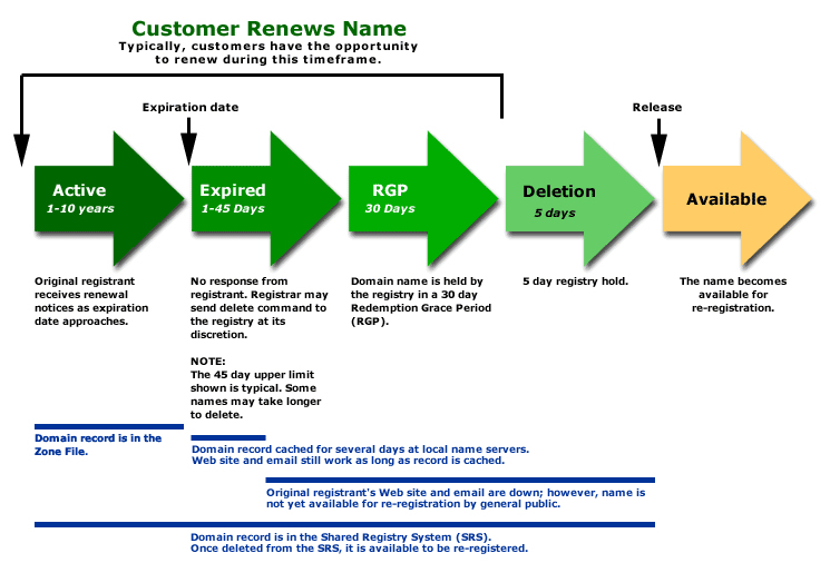
The Xero Dashboard
When you first login you are greeted by a welcome message. This isn’t particularly unique, but it has nice touches. A warm dialog, pre-loaded sample data and a link to view the sample data straight away. They even have a different demo company set up for each country they operate in, taking into account local accounting rules etc. But that’s not all! Once you load the Demo Company data you can either take a tour, or tackle one of the top 10 tasks that people complete in Xero.

Getting Started Alert
I think this shows a good level of hand-holding, but also of understanding and targetting your customers.
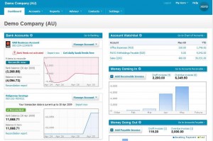
Another nice usability touch is the auto-logout function. Users generally hate the auto-logout 99% of the time, but it does save their bacon that final 1%. To make it as unbtrusive as possible Xero use a lightboxed login box when your 30 minutes is up (and it is good they actually display the limit here too). This makes logging back in a breeze, and teasing the user with all their content subtly appearing under the lightbox makes them feel that it isn’t a big process to dive back into the software again.

Lightbox style Auto-Logout
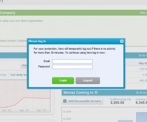
Reports are another area where usability is always difficult, in this case navigating to the reports that you use most regularly. Xero allows the user to simply click the star next to the report, and that report will then appear in the higher level Reports dropdown. You never have to see the full list of reports again!

Simple report navigation
It’s pretty minor, but it is a solution I never thought of to a problem I have faced for a while.
Finally one last idea that looks simple, but is actually very effective. The action button that performs more than one action:

Consolidated Action Buttons
I like this because it keeps action buttons to a minimum, allowing them to be placed more consistently and concisely on a screen. It also forces you to make sure the actions on a page are related and required.
Other nice elements include inline help content throughout, consistent positioning and colouring of action buttons, good usage of white space around tabs and tables, the ability to save drafts or ‘publish’ data entry and the use of simple language (“Money coming in” rather than “Accounts Receivable”).
Well done Xero, you are now my usability reference whenever I get stuck! 🙂

